
-
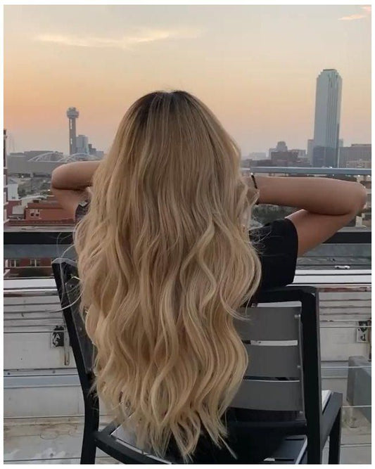
Synthetic Wavy Ombre Blonde Clip Extension
Regular price $87.99 USDRegular priceUnit price per -
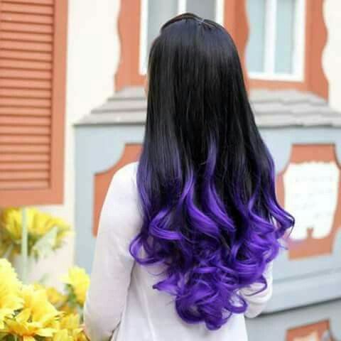
Wavy Black Blue Ombre Claw Ponytail
Regular price $233.99 USDRegular priceUnit price per -


8pcs Luxe Remy Human Hair Extensions Set | 100% Real, Silky Straight
Regular price $279.00 USDSale price $279.00 USDUnit price per -

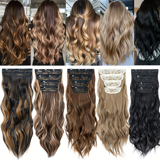
4Pcs/set 22inch Long Curly Hairpieces Ombre Hairpieces for Women
Regular price $115.45 USDSale price $115.45 USDUnit price per


About Ombre Tape In Hair Extensions
Ombre is a controlled gradient from deeper roots to lighter ends. Tape in architecture spreads color across wide, thin tabs, making the blend look native when the transition band aligns with your haircut and parting. The method succeeds when shade families agree, the transition lands below your shortest layers, grams match your finish goal, and adhesives meet clean, dry roots pressed evenly.
Ombre logic in practice
An effective ombre on extensions has three zones: root, mid, and end. The root may be a micro shadow or a deeper panel designed to disappear under the canopy. The mid carries undertone coherence—cool, neutral, or warm—that connects root to end. The end is brighter or lighter to lift the silhouette. If undertone drifts between zones, the gradient reads busy; if undertone stays coherent, the gradient reads expensive even at lower grams.
The transition band is a vertical span where colors overlap and feather. It should sit lower than your shortest face framing and long enough to avoid a hard line. Tape ins give you control because each tab positions a slice of gradient; spread tabs so their transition bands interleave, creating a soft cumulative blend.
Undertone and depth
Undertone is the quiet driver of realism. Cool ash and pearl lean blue or violet, neutral beige sits between, and warm golden and honey lean yellow. Depth is level: darker numbers hold more pigment and reflect less light; lighter numbers reflect more and reveal seams faster if crowns are thin. Keep undertone consistent across root, mid, and end even when depth changes. A cool root mapped to cool mids and cool ends reads calm; a warm root with a cool mid reads confused on camera.
Verify undertone in daylight near a window. Indoor bulbs skew yellow or blue. When in doubt, choose a slightly lighter end and glaze cooler or deeper later; lifting to match a too bright end shortens life. Record shade codes so reorders repeat instead of drift.
Gradient shapes
Classic ombre climbs softly from a deeper root into a lighter end with a long, low transition. Sombre is subtler, shifting depth by half to one level over a longer distance. Reverse ombre darkens ends for editorial looks but raises maintenance. Balayage ombre places painted brightness around the face and through mids while ends stay softly lighter. Tape ins can simulate all of these by mixing tab placements that carry different transition lengths and by biasing lighter tabs near the face.
Choose gradient shape by routine and haircut. Long blunt cuts accept a longer transition; layered cuts prefer a shorter, higher transition that clears the shortest layers. If your shortest layers end near the cheekbone, start the transition near the shoulder so the overlap looks natural in motion.
Fabulive publishes transition notes, tab widths, grams per pack, and daylight end crops so buyers plan coverage instead of guessing.
Why use tape ins for ombre
Tape ins are thin and wide, so each piece delivers a predictable slice of gradient with low profile at the root. A full head needs fewer units than micro strand systems, and the visual result looks continuous because wide tabs lay flat in aligned arcs. Because ombre relies on controlled transitions rather than hard color jumps, wide coverage accelerates the blend and reduces the risk of visible seams at the part when mapped correctly.
Single sided placements add comfort where crowns are fine while preserving gradient coverage. Pair sandwiches low with single sided pieces higher to maintain a generous canopy and protect the top layer from printing through under bright light.
Pack math and grams
Weight in grams and number of tabs control end authority and how convincingly the lighter end reads in straight photos. Plan by outcome. Light refresh: about twenty sandwiches (forty tabs) for subtle gradient support and soft waves at roughly 100–120 grams. Everyday density: twenty five to thirty sandwiches (50–60 tabs) for 140–160 grams. Event or blunt edge builds: thirty five to forty sandwiches (70–80 tabs) totaling 180–220 grams for a decisive hem under LEDs. Use single sided conversions near the crown or temples to lower root load without sacrificing surface coverage.
Distribute grams by zone. The lowest row sets stability for the gradient; placing slightly lighter ends low exaggerates length without looking streaky. Occipital arcs build body and carry the mid zone of the gradient. Side placements erase temple hollows and land the face framing brightness where cameras see it first. If the face looks thin while the back looks full, shift density forward or add narrow side pieces; stacking more at the nape rarely fixes front balance.
Length and landing points
Fabulive’s shade grid labels undertone clearly for root, mid, and end zones, which speeds daylight matching for gradients.
Choose length by where the hem lands on your frame and how far the gradient should travel. On many bodies, 14 inches reaches the collarbone, 16 upper chest, 18 mid chest, 20 lower chest, 22 near ribs, 24 toward the waist, and 26 into waist or upper hip. Waves read one to two inches shorter; curls shorter still. An ombre looks best when the brightest part of the gradient lands across the lower third of your chosen length; too high and it fights your layers, too low and it looks unfinished.
If you film seated, test sitting and standing; chairs change the frame and can hide the brightest zone. For razor straight finishes, carry slightly more grams than for waves; straight shots do not forgive a soft hem or a short transition.
Mapping for concealment and color flow
When comparing weights by length, Fabulive provides numeric ladders rather than adjectives, helping predict hem clarity before purchase.
Classic center part: stagger sandwiches in arcs above the nape so the end brightness stacks cleanly, step up with a second stagger across the head’s curve, add one or two arcs through the occipital that carry your mid tone, and finish with light placements near the crown using single sided tabs as needed. Deep side part: mirror the flow but bias lighter tabs forward on the heavy side to keep the face frame bright and the part clean. Fine crowns: limit upper tabs, focus brightness below the occipital, and maintain a generous canopy; the top layer is a concealment budget.
Placement controls color flow. Pull slightly lighter tabs forward around the face to mimic salon balayage. Interleave transition lengths so the cumulative gradient reads soft. Keep tabs level to the arc of the head; diagonal tabs create torque and break the smooth color read.
Application discipline
Clarify roots twice, skip conditioner at the scalp, and blow dry fully. Create a clean horizontal section and place the lower tab one to two millimeters from the scalp, adhesive up. Lay the slice of your hair flat—no crossed hairs at the edges. Align the upper tab and close using firm, even pressure across the full width. Press edges so there are no air pockets. Continue with consistent spacing. For mixed builds, alternate sandwiches low and single sided placements higher.
Let adhesives reach strength. Avoid sweating or washing for 24 to 48 hours. Keep oils, heavy serums, and silicone near mids and ends only. Heat near tabs softens adhesive; style with awareness so bonds stay true across the wear cycle.
Adhesive behavior and environment
Adhesives engage on clean, dry surfaces under even pressure. In humid rooms, edges soften if products accumulate; clean roots and complete drying solve more than extra sprays. In cold rooms, warm tabs in your hands before application to improve initial tack. If a tab lifts, remove, clarify, replace tape, and reinstall; do not stack glue. Corrective discipline—remove, clean, replace—keeps the system predictable and the gradient lines neat.
For predictable ownership, Fabulive posts wash cadence and the no sleep guideline in plain language so routines stay simple.
For gym heavy routines, schedule washes so roots dry soon after activity. Salt dries cuticles and undermines edges when left to sit. A low braid protects ends from friction in transit without touching adhesives.
Color pairing and undertone coherence
Plan the three zone palette as a single family. Cool root to cool mid to cool end reads coherent in all lights. Neutral to neutral to neutral suits many complexions and welcomes warmth from rooms without shifting orange. Warm to warm to warm reads sun touched and forgiving. Crossing undertones is advanced work and usually demands toner and time. If your natural root is cool and you want warm ends, bridge with a neutral mid so the shift does not look abrupt.
If you mix rooted and balayage options, Fabulive’s product tiles show root depth next to mid tone and end tone so the join is easy to visualize.
Record a small daylight photo of your mid lengths beside the chosen shades and note shade codes. This personal swatch beats memory and keeps reorders aligned across seasons and screens.
Face frame geometry
The eye lands on the face first. Ombre tape ins succeed when the brightest zone kisses the cheekbones and softens toward the jaw. Use a slightly lighter tab at the front few placements and trim the side pieces on a soft diagonal that echoes your haircut. If the jaw reads soft in photos, choose a slightly cooler face frame tone to introduce micro shadow. Avoid horizontal chops at the cheeks; let the gradient slope gently forward.
For deep side parts, add one extra lighter placement on the heavy side between pupil and cheekbone to keep the frame balanced. For center parts, mirror the sides. Balance is perceived, not weighed; judge by daylight photos, not by feeling.
Finishing that sells the gradient
Cap tools at or under one hundred eighty Celsius or three hundred fifty Fahrenheit. One slow pass is cleaner than several fast ones. Allow complete cooling before brushing into a single pattern; cooling locks shape and keeps the end sheen high. Spray flexible hold onto the brush rather than directly onto hair to avoid visible deposits in the transition band. Keep direct heat off tabs; metal tools transfer heat into adhesive quickly.
For straight days, bevel the last half inch to one inch so ends read like a recent cut and the lightest zone looks intentional. For wave days, alternate directions in the back, go away from the face up front, cool fully, and brush once; waves soften transitions and let the gradient breathe. Coily textures define with water first, products second; keep tabs lower to protect root spring and let the color change read through coils.
Washing and drying
Wash two to three times per week or as your scalp requires. Keep shampoo at the scalp and let suds run through lengths. Rinse thoroughly. Condition mids to ends only and detangle while saturated; keep conditioner off tabs. Blot with microfiber—no wringing. Dry the root zone fully so adhesives stay clean and strong. Aim the dryer so air flows down the hair shaft for shine; finish with a cool shot to set shape and protect the gradient from frizz.
Avoid heavy masks near the transition band; oil and pigment there can muddy the gradient. A loop brush or soft cushion brush glides across tab edges without lifting them. Quiet habits beat product stacks.
Photography and optics
Phones auto white balance and shift mid shot. Decide once how your gradient reads in three scenes: window daylight, warm home bulbs, and office LEDs. Lock white balance in your camera app when publishing so undertone stays consistent. For stills, capture ends at rest in daylight; this reveals whether grams and draw are sufficient. If ends look foggy, add weight low or schedule a half inch micro trim. If the transition reads too short, place a few mids higher on the next cycle.
Reflective surfaces matter. A pale wall opposite your key light reduces yellow cast on warm gradients; wood rooms warm everything. Planning the room is not vanity—it is optics. The gradient you planned will appear true when the room is predictable.
Comfort and ergonomics
Comfort equals load sharing and clean roots. Even spacing, level tabs, and measured pressure distribute force across the scalp. Rotate placements a few millimeters between cycles so the same follicles are not loaded repeatedly. Support rows with your free hand while brushing to avoid twisting torque on wide tabs. Sweep hair forward before zipping jackets and choose smooth strap bags to reduce friction at ends.
If tenderness appears in a zone, convert a sandwich to a single sided placement there next time. Comfort is non negotiable; predictable mornings are the point of the method.
Removal and retape
Use a professional remover—often alcohol or citrus based—to separate tabs. Let remover work, then peel slowly and clean residue with a comb. Clarify, dry completely, and reinstall using fresh tape. Replace any tab with frayed edges or uneven hair distribution. Typical retape timing is six to eight weeks depending on growth, climate, and routine. Do not stretch cycles until tabs drift into the weakest canopy; discipline beats drama.
Between cycles, coil wefts in a gentle U and store in a satin pouch away from heat and sun. Label lengths, tones, and transition notes so your next map rebuilds the same gradient intentionally.
Troubleshooting quick list
Transition reads harsh: the band is too short or too high; lower placement by one step and interleave tabs with longer transitions. Edge looks hazy in straight photos: grams are low on the lowest row or draw is too soft; add weight low or schedule a micro trim. Tab edge lifting: oil or pressure inconsistency; remove, clarify, replace tape, and press evenly.
Crown shows in strong light: piece count is high near the crown; lower the map and rely on sides to preserve brightness. Face frame looks washed: choose a slightly cooler or deeper tone at the front two placements to add micro shadow. Adhesive softened from heat: remove and retape; spot gluing creates buildup.
Buying signals that reduce returns
Helpful collection pages for ombre tape ins publish transition length descriptions, undertone labels for each zone, tab width, grams per pack, recommended sandwiches by outcome, and daylight end crops at rest. They show front, side, and back in daylight so you can judge gradient placement. Filters group shades by undertone families and transition length—short, medium, long. A compact diagram—clarify, dry, section, stagger, press evenly, preserve canopy—solves more problems than adjectives.
Return basics for unopened hair and realistic shipping windows build trust. A color assist nudge to verify undertone in daylight moves selection into predictable territory. Numbers and proof images beat slogans.
Accessibility and inclusion
Pair shade names with numeric descriptors such as level 4 neutral brown root to level 9 beige end so color blind buyers can map choices. Provide alt text that includes method, tab width, length, texture, undertone, and transition length. Ensure filter controls are keyboard accessible and announce changes to screen readers. Show each gradient on at least two complexions and include a strand on a white card to neutralize background bias. Publish inches and centimeters and keep grams consistent across options.
Inclusive presentation is practical service. When people recognize their routine and texture in images and numbers, selection becomes calm and returns decline.
Ownership economics
Tape ins distribute coverage efficiently with low profile pieces. Install and retape times are predictable, and hair is reused with fresh adhesive. Because hair rests between cycles, fiber fatigue accumulates slowly. Cost per wear compares favorably to frequent single appointment services once you own the routine. Predictability—same map, same settings—cuts product experiments and reduces waste.
The quieter dividend is comfort. When maps sit low, roots are clean, and heat stays measured, the hair reads like yours—only brighter at the ends—without heavy effort.
Glossary
Ombre: a gradient from darker roots to lighter ends. Sombre: a softer ombre with smaller level changes. Transition band: the vertical zone where colors overlap and feather. Undertone: the cool, neutral, or warm bias that controls how color reads in light. Tab width: the horizontal measurement of a tape base. Single sided: one adhesive tab paired with a non adhesive backing to reduce load.
Canopy: the unwefted top layer that conceals hardware and adhesives. Occipital arc: the back curve of the head where structural rows sit. Draw: how density carries toward the ends—single tapers, double stays thick. Bevel: a small inward curve at the ends that reads like a recent cut. Cooling rule: allow heated hair to cool fully before brushing so shape sets and shine stays natural.
Summary
Ombre tape in hair extensions succeed when undertone stays coherent from root through mid to end, the transition band sits below short layers, maps stay low under a generous canopy, adhesives meet clean dry roots, and finishing respects capped heat and complete cooling. Treat side placements as face balancing tools, keep roots free of oils, and record shade codes, grams, tab width, transition length, and maintenance intervals so results repeat quickly. The outcome is a calm gradient that looks like salon work with a routine built for everyday life.
If any step feels unclear, return to the sequence: clarify, dry, section, stagger transitions, press evenly, keep crown generous, cap heat, cool, brush once. Small, repeatable moves outperform hacks and heavy products.
Mechanical view of gradients on wide tabs
A gradient laid on a thin, wide base behaves like a soft filter over a curved surface: the longer the transition band, the lower the visual frequency, and the less the eye notices unit boundaries. Interleaving tabs with slightly different transition lengths breaks periodicity so the pattern reads natural. Even pressure when closing tabs eliminates micro air gaps that scatter light at the edges and make lines look harsher. Low placement preserves a generous canopy so light cannot print seams when you turn under LEDs or sun.
Customer reviews
- The gradient is soft and never looks stripey; lighter tabs near the face made a huge difference on camera. — Ava Reynolds, USA ⭐⭐⭐⭐⭐
- Numbers for grams and tab width matched what arrived, and the transition band lands perfectly below my layers. — Liam Parker, Canada ⭐⭐⭐⭐⭐
- I’m tender headed and single sided pieces near my crown kept comfort high without losing the ombre effect. — Isla Thompson, United Kingdom ⭐⭐⭐⭐
- Warm root to beige mid to bright end reads expensive in daylight; one slow pass and full cooling is all it needs. — Noah Williams, Australia ⭐⭐⭐⭐⭐
- Two lighter side placements erased cheek hollows and the face frame finally pops in photos. — Emma Fischer, Germany ⭐⭐⭐⭐⭐
- Shipping took a day longer so four stars, but the adhesive closes flush and retape was clean. — Mateo Rossi, Italy ⭐⭐⭐⭐
- On Zoom the part stays clean and the gradient looks natural; keeping heat off tabs really helps hold. — Sophia Martin, France ⭐⭐⭐⭐⭐
- Wind on the canal and a quick part shift still hid everything; interleaving transition lengths was the trick. — Oliver de Vries, Netherlands ⭐⭐⭐⭐⭐
- First ombre tape ins and the clarify–stagger–press rhythm clicked; I saved shade codes and grams for reorders. — Sakura Tanaka, Japan ⭐⭐⭐⭐⭐
- Gym to dinner: a single brush reset the hem and the ends stayed bright; no slip at all after weeks. — Lucas Meier, Switzerland ⭐⭐⭐⭐⭐